Propósito Eventos
Responsive Web Design
The Project
Propósito Eventos is a company dedicated to organizing weddings and other types of celebrations, but primarily weddings. Most event planning companies in the city don't have a website; they only conduct their business through social media. This means requesting a quote lacks formality and takes time. Therefore, Propósito Eventos wanted to go further and add an online quoting and booking system. Throughout this presentation, you will find the results of the research and subsequent design of the website.
My Contribution
UX Designer leading the website design for Propósito Eventos, and UX Researcher.
Responsibilities include conducting interviews, creating paper and digital wireframes; developing low- and high-fidelity prototypes; performing usability studies; considering accessibility; and iterating on designs and responsive design.
The Process
Time
August - September 2023
I conducted user interviews to create empathy maps, allowing me to better understand the end user and their immediate needs. The research revealed that users are typically pressed for time when organizing their wedding or any other event, juggling numerous tasks and searching for everything separately. Very few companies in the area offer this type of service with all the added value, and even those that do are difficult to contact and schedule appointments with. None of them have a website showcasing reviews, organized photos, promotions, and direct contact information. Although they all have social media presence, the lack of a professional website makes the companies appear unprofessional and presents their services in a disorganized manner, creating another problem for the user instead of solving their organizational challenges.
Weaknesses
Web Site
Most event planning companies can only be contacted through social media, which makes them seem like informal businesses, as they don't have an established website.
Information
The few companies that do have a website have a poor design and lack adequate information for the customer, causing them to waste more time searching for information, calling companies, and delving into the details.
Offers
The limited offers that companies maintain online are outdated, have not been updated, and the user must contact them again to find out about any current promotions.
Organize Ideas
Social media platforms do not display information in an organized way that meets the user's needs, so users have to spend much more time searching until they find what they are actually looking for, resulting in a less than ideal experience.
Problem Statement
Persona
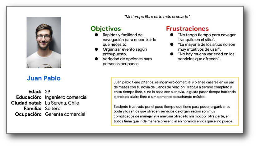
Juan Pablo is a busy business engineer who needs to hire a service for his wedding because he lacks the time to do it himself.
User journey map
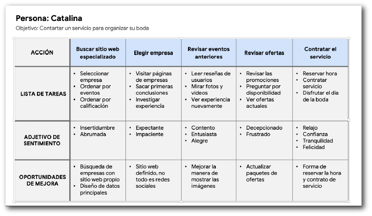
I created a user journey map of Catalina's experience to help identify pain points and opportunities for improvement.
Digital Page Layouts
Information Architecture: Site Map
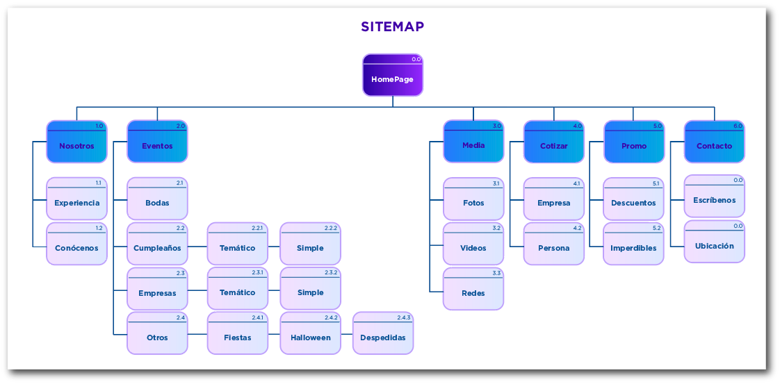
The difficulty of finding certain information on the few similar websites was considerable, as most only operate through their social media channels, which was one of the most frequent pain points for users. The main objective in the information architecture is to make site navigation specific and directly relevant to what users are looking for; hence the chosen structure, designed to make the entire experience easier and simpler.
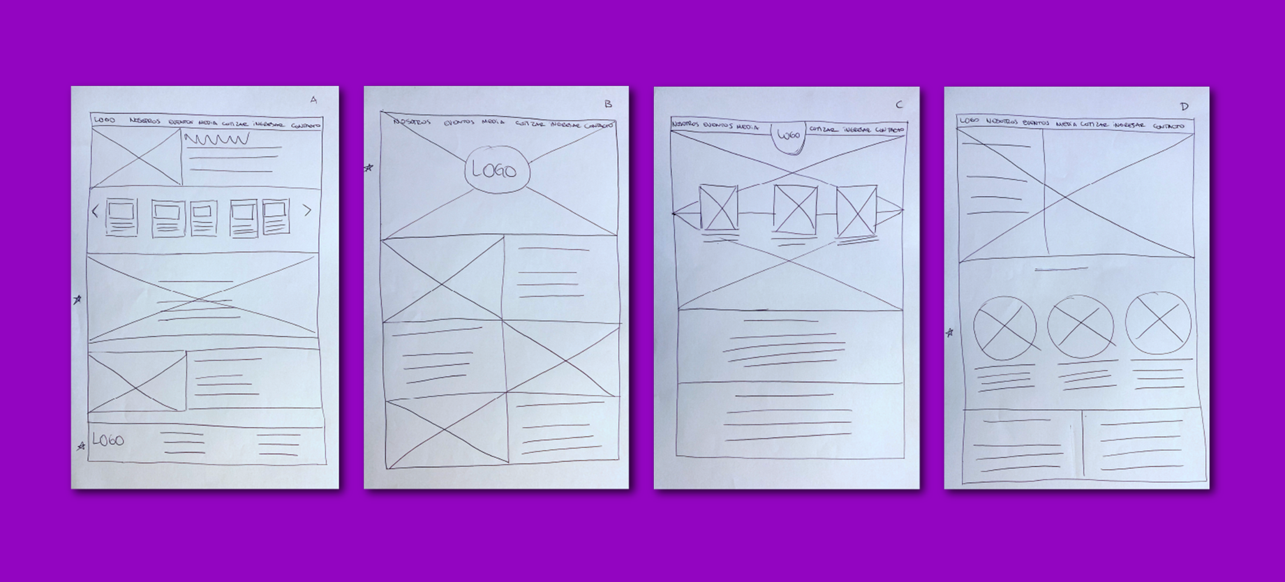
Paper Schemes
What we see below are the wireframes for the homepage. We can see four designs, which served as the starting point for creating the final homepage layout. As you can see, markers were used to select the elements that would later appear in the mockup.
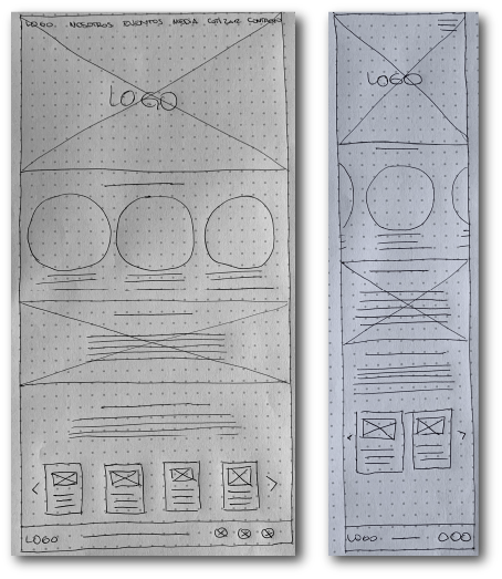
Screen size variation
Previous design iterations focused on optimizing the user experience across different screen sizes, as most people access the internet from various devices, but primarily from their mobile phones. This is why we emphasize a responsive page layout that adapts to multiple screen dimensions.
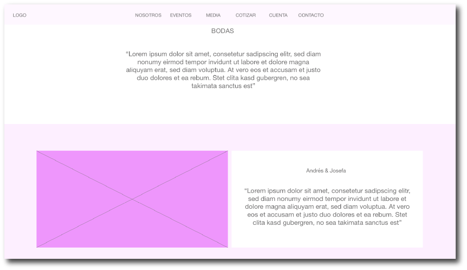
Digital page layouts
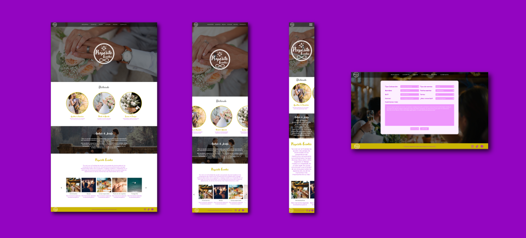
The paper page layouts were the starting point that led to the final result we see below. Most people look for information about offers and promotions. They also want to request a quote directly, expecting to receive a formal response. This is why the option to request online quotes was added, as a way to ease the user's burden and make their experience on the website a positive one.
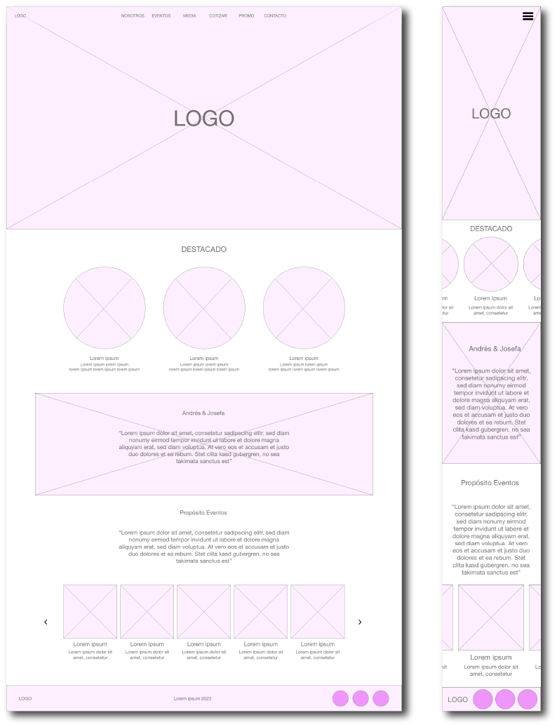
Screen size variation
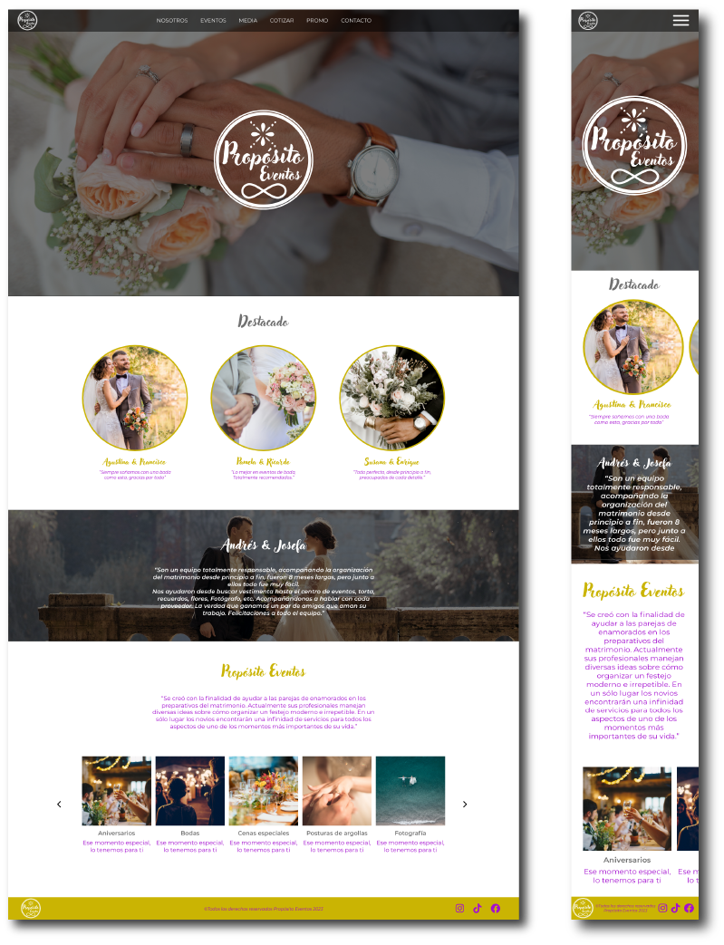
These are the home screens for both the desktop and mobile versions after several iterations.
Lo-fi prototype
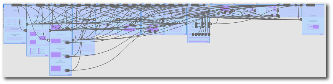
In this prototype, we can see the complete user interaction with the site, from the home screen to the contact page. The specific placement of the buttons and links was determined through iterations and approvals from the other people who evaluated the prototype from its initial stages.
Usability study: Findings
Information
Most websites have very little information; they only feature images on social media and relevant information on related websites. Everything else has to be found out by calling a phone number, sending an email (which often goes unanswered), or, as is common these days, contacting them only through messaging apps.
Promotions
The promotions and offers that are posted are not recent. Another major drawback is that they don't publish their current prices, so users have to waste even more time calling or making inquiries through various platforms.
Quotes
None of them have an online quoting system; they all send the quotes via email after two or three days. This makes the waiting process slower and prevents us from moving forward with the rest of the plans for the event.
Perfecting The Design
Models
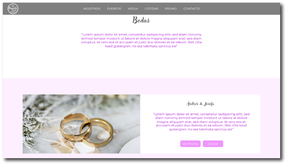
The final conclusions of the usability study revealed that it was necessary to add shortcut buttons to the offer and quote screens, as many users do not want to spend more time than planned on the website. Therefore, we have decided to send them directly to what they are looking for in the corresponding section.
Before the usability study
After the usability study
Screen size variations
I included designs for two screen sizes in my mockups, as users have greater access to technology and therefore use different devices to browse and search for information. The goal is to provide a good user experience, which is why I'm showing the homepage design for tablets and mobile phones here.
Hi-fi Prototype
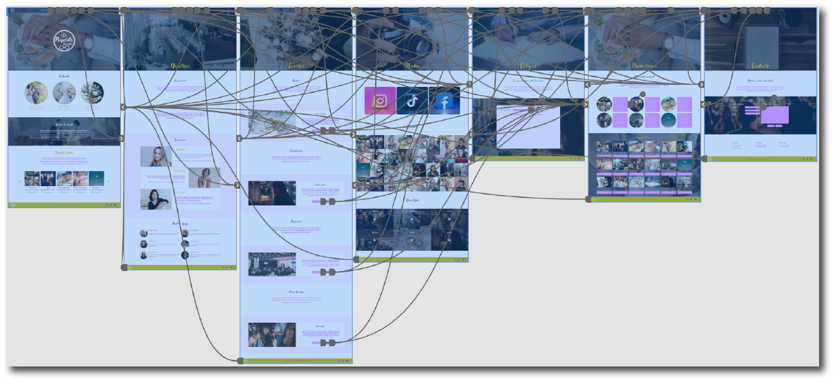
This is a screenshot of the high-fidelity prototype, which faithfully followed the iterations and changes resulting from the usability study. We can see the connections between each of the screens as the user interacts with each call to action.
Accessibility considerations
The website was designed with easy-to-see colors that create high contrast between them, so that anyone with vision problems can have a good experience.
I used landmarks to help users navigate the site.
The typography used was selected in such a way that it would not lose its sobriety or solemnity, while also being easy to read.
Impact
Every person who tested the design was satisfied with the results, as they were able to effectively complete the objectives they were given.
What did I learn?
What struck me most while creating this project was that most of the other companies I researched didn't have a website, claiming that in these modern times, nobody needs a website anymore, that everything is done through social media. As I progressed with the design, I realized that many people need a website that provides clear and formal instructions, since social media lacks that formality.
Next Steps
Conduct usability tests to further improve the user experience.
Conduct surveys to identify other needs and add them to the new website.
Improve the designs for smaller screens, adding the same features as a desktop screen.
Let's work together?
If you liked what you saw, let's stay in touch!